

To visualize data with bar charts effectively, start by selecting the right type—vertical, horizontal, stacked, or grouped—to suit your data. Keep your design simple with clear labels, contrasting colors, and consistent axes at zero to guarantee accuracy. Use annotations and appropriate sorting to highlight key insights. Avoid clutter and overly complex charts. If you continue exploring, you’ll discover tips to enhance clarity and storytelling in your bar charts.
Key Takeaways
- Select the appropriate bar chart type (vertical, horizontal, stacked, grouped) based on your data and comparison needs.
- Ensure axes start at zero and use clear labels to accurately represent data relationships.
- Choose contrasting colors and concise labels to enhance readability and highlight key insights.
- Add annotations, lines, or markers to emphasize important trends or data points.
- Keep the design simple by avoiding unnecessary effects, clutter, and ensuring consistent formatting for clarity.
Understanding the Fundamentals of Bar Charts

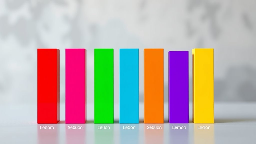
To understand the fundamentals of bar charts, it’s vital to recognize their primary purpose: comparing data across categories. You use them to see how different groups or categories stack up against each other, making it easy to identify rankings and differences. Bar charts also display how often specific values occur within a dataset, helping you analyze frequency distributions. They highlight deviations from expected or norm values, offering clear insight into data anomalies. Each bar represents a specific category, with its height or length reflecting the value. The x-axis shows categories, while the y-axis measures quantities. When designed well, bar charts use clear labels, contrasting colors, and appropriate scales to guarantee your data is easy to interpret and visually engaging. Additionally, understanding the effectiveness of visualizations can help you create more impactful and accurate representations of your data. Incorporating visualization best practices ensures your charts communicate insights effectively and reduce misinterpretation.
Choosing the Right Type of Bar Chart for Your Data

Choosing the right type of bar chart depends on your specific data goals and the nature of your dataset. If you want to compare categories directly, vertical bar charts are most effective. For long category labels or rankings, horizontal bar charts work better. To show parts of a whole, opt for stacked bar charts, which display cumulative totals clearly. When analyzing multiple metrics within each category, grouped or clustered bar charts provide clarity. If your focus is on trend analysis over time, vertical bars illustrate changes effectively. For proportional data, stacked charts highlight composition, while horizontal bars handle long labels seamlessly. Additionally, understanding the Relationship dynamics depicted in your data can help you choose the most meaningful visualization method. Always match the chart type to your goal, ensuring clarity and accurate data representation.
Designing Clear and Effective Bar Charts

Designing clear and effective bar charts requires careful attention to visual simplicity and readability. Keep the design clean by avoiding shadows, thick outlines, and excessive gridlines that create clutter. Label axes clearly and include units to help viewers interpret data easily. Incorporate visual clarity principles to ensure your chart is accessible and easy to understand. Maintain logical alignment by ordering categories alphabetically or by value, and guarantee high contrast with accessible colors for better visibility. Proper spacing—about 50% of the bar width—makes comparisons easier, while removing unnecessary decorations prevents distraction. Choose between horizontal and vertical bars based on label length to improve readability. Use a limited, consistent color palette with patterns or textures for differentiation. Organizing elements logically, removing distractions, and tailoring the layout to your audience help create a straightforward, impactful chart. Additionally, considering industry trends can guide you in selecting modern design elements that resonate with viewers.
Ensuring Accurate Data Representation With Proper Axes

Ensuring accurate data representation with proper axes is essential for creating trustworthy bar charts. You should always set the baseline at zero to accurately reflect differences between data points. Avoid truncating axes, as it can exaggerate disparities and mislead viewers. Use clear labels and titles on axes to provide context, making it easier for your audience to interpret the data correctly. Proper axis calibration is especially important when dealing with contrast ratios, as they significantly influence the perceived quality of images. Additionally, understanding the AI bifurcation can help in designing visualizations that effectively communicate complex data related to AI developments. Consistent scales across multiple charts help facilitate comparisons, while proper axis limits ensure all data is visible without distortion. Be cautious of visual perception—larger bars can seem disproportionately significant—so calibration is crucial. Incorrect baselines or truncated axes can distort relationships, so double-check your setup.
Selecting Colors and Labels to Enhance Readability
Effective use of colors and labels in bar charts can substantially improve their readability and interpretability. Choose color families thoughtfully: blues and greens work well for primary data and positive trends, while muted tones prevent clutter. Highlight important data with prominent colors, and use muted shades for less critical information. Incorporating visual organization techniques can further clarify data relationships and enhance viewer understanding. Be mindful of accessibility—patterns can help distinguish red and green for color-blind viewers. Use distinct colors for categories and gradients for sequenced data to convey progression clearly. Labels should be concise and positioned to avoid clutter; only mark key data points. Ensure axes, titles, and legends are easy to read and well-placed. Proper contrast, consistent fonts, and strategic color choices make your chart more intuitive, guiding viewers effortlessly to insights. Additionally, considering privacy policies and user experience can influence how your visualizations are presented on interactive dashboards, ensuring compliance and accessibility.
Managing Data Complexity: Simplifying Your Bar Charts

Managing data complexity is key to creating clear and insightful bar charts. Your goal is to simplify datasets so patterns and trends stand out. Use data aggregation to summarize information, making comparisons easier. Incorporating emotional support strategies can help you manage the stress that often accompanies data analysis, leading to clearer insights. Filtering data helps focus on relevant points and reduces clutter. Cleaning your data by removing irrelevant or corrupted entries guarantees accuracy. Employ techniques like reducing the number of categories or data points to prevent overcrowding. Visual simplicity can be achieved by removing backgrounds, redundant labels, and unnecessary borders. Limit your color palette to highlight key insights without overwhelming the viewer. Remember, a simple, focused bar chart communicates your message more effectively than one overloaded with details. Maintaining accessibility considerations ensures your visualizations are interpretable by a broader audience. Clarity and straightforwardness are essential for turning complex data into actionable insights.
Applying Sorting and Annotations for Better Insights

Applying sorting and annotations transforms your bar charts into clearer, more insightful tools. Sorting helps you compare data easily by arranging bars in descending or ascending order, highlighting the most or least significant points. You can also sort by categories, such as alphabetically, or by subcategories in stacked charts to reveal patterns. Additionally, understanding the importance of Halloween themes can add context to themed data visualizations. Incorporating animated movies can make your presentations more engaging and relatable for diverse audiences. Annotations add context, drawing attention to key values or trends with concise labels, arrows, or lines that connect related points. Using consistent color schemes for bars and annotations maintains clarity, while avoiding clutter ensures your chart remains easy to interpret.
These features, available in tools like Tableau, help you emphasize important insights and make your data storytelling more effective. Properly applied, sorting and annotations make your bar charts much more powerful.
Combining Bar Charts With Other Visualizations

Combining bar charts with other visualizations allows you to present complex data more all-encompassing by integrating multiple chart types into a single view.
Combining bar charts with other visualizations creates a more comprehensive view of complex data.
By pairing bars with lines, you can display categorical data alongside trends, making deviations easier to spot. Dual-axis charts help visualize both metrics clearly without clutter.
Multi-mark visualizations, which include bars, lines, or scatter plots, enable you to analyze different metrics simultaneously, especially with tools like Tableau. These combination charts are excellent for comparing categories and tracking changes over time.
Interactive features such as cross-highlighting and filtering further enhance insights. When creating these charts, select appropriate data fields, adjust axes, and ensure clarity to avoid overlap.
Understanding efficient general ledger coding can also improve the accuracy of your data representation and analysis. Additionally, incorporating vibrational energy concepts can help you interpret the underlying patterns in your data more intuitively.
This approach provides a comprehensive, dynamic view of your data.
Common Pitfalls to Avoid When Creating Bar Charts

Creating effective bar charts requires careful attention to detail, as small mistakes can lead to misinterpretation of your data. First, avoid misaligned axes—starting the y-axis above zero can exaggerate differences. Use enough data points; too few make trends unclear. Keep legends simple; too many items confuse viewers. Choose colors carefully—limit similar shades to highlight differences. Eliminate unnecessary complexity, like 3D effects, which reduce clarity. Properly scale your axes to prevent distortion, and don’t overload the chart with categories. Label clearly, space bars adequately, and maintain consistent formatting. Additionally, understanding divorce statistics can help contextualize your data for specific audiences. Incorporating relevant data visualization principles ensures your chart is both accurate and engaging. Finally, consider your audience’s needs and provide context to ensure your chart communicates your message effectively.
Frequently Asked Questions
How Do I Choose Between Vertical and Horizontal Bar Charts?
When deciding between vertical and horizontal bar charts, consider your data and presentation needs.
If your categories have long names or you want to compare multiple values easily, go horizontal.
If your data has a natural order or shows trends over time, choose vertical.
Also, think about space, clarity, and audience readability.
Both types are versatile, so pick the one that best highlights your data story and suits your layout.
What Are the Best Practices for Labeling Bars and Axes?
Labeling bars and axes is like giving clear signposts on a busy road. You should label bars directly for quick understanding, placing annotations inside or at the ends. Keep labels simple and avoid clutter, focusing on key data points.
Use descriptive, easy-to-read axis labels with units, positioning them outside the plot area. Consistent colors and spacing help viewers compare data easily, ensuring your chart remains clear and honest.
How Can I Effectively Compare Multiple Data Series?
To effectively compare multiple data series, you should use grouped or side-by-side bar charts. These formats place different datasets next to each other within the same category, making it easy to spot differences and similarities.
Choose the chart type that best suits your data, and guarantee clear labels and consistent scales. This approach helps your audience quickly grasp how the series relate, highlighting key insights efficiently.
When Should I Use Stacked Versus Grouped Bar Charts?
You’re about to make a decision that could change your data storytelling forever! When choosing between stacked and grouped bar charts, consider your goal.
Use stacked charts to show part-to-whole relationships and totals, especially with fewer categories.
Opt for grouped charts when comparing sub-categories across groups.
How Do I Prevent Misleading Visual Distortions in Bar Charts?
To prevent misleading distortions in bar charts, you should start by ensuring the y-axis begins at zero, maintaining proportional visuals. Use consistent scales across charts for accurate comparisons, and label everything clearly.
Avoid truncating axes or cherry-picking data. Keep things simple by reducing variables, and verify data accuracy regularly.
Following established standards like IBCS helps maintain transparency, ensuring your audience interprets the data correctly without distortion or bias.
Conclusion
Mastering bar charts can transform your data storytelling from ordinary to legendary. By understanding the fundamentals, choosing the right type, and designing thoughtfully, you’ll turn complex data into clear, impactful visuals that captivate any audience. Avoid common pitfalls, add meaningful annotations, and combine with other charts for maximum insight. With these tips, your bar charts will shine brighter than a supernova, making your data not just seen, but unforgettable.