
To avoid misleading graphs, always scrutinize axes and their scales before drawing conclusions. Make sure axes start at zero when appropriate and check for consistent intervals, as irregular spacing can distort data perception. Be wary of truncated or manipulated axes that exaggerate or minimize differences. Develop a critical eye for visual cues that hint at distortion and question data interpretations. Keep learning about common pitfalls, which can help you spot and avoid misleading visuals with confidence.
Key Takeaways
- Always verify if axes start at zero when appropriate to prevent visual exaggeration.
- Check for inconsistent interval spacing and compare visual differences with actual data values.
- Critically analyze axes labels and ranges to ensure they accurately represent the data.
- Be alert for truncated or manipulated axes that may distort the perceived trends.
- Develop strong interpretation skills and question the visual narrative to identify potential scale distortions.

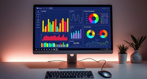
Graphs are powerful tools for visualizing data, but they can easily mislead if not designed carefully. One common way this happens is through scale distortion, where the visual representation exaggerates or minimizes differences. When the scales on the axes aren’t consistent or are manipulated, small variations can appear huge or insignificant, skewing your perception of the data. For example, a bar graph with a truncated y-axis can make minor increases seem dramatic, leading you to draw conclusions that aren’t supported by the actual numbers. Recognizing this requires paying close attention to the axes’ ranges and whether they start at zero or are truncated to emphasize certain trends. Manipulating axes isn’t always malicious; sometimes, it’s an unintentional oversight, but in either case, it impacts the graph’s integrity.
Axis manipulation involves changing the scale, intervals, or starting points of axes to create a misleading impression. You might see a line chart where the y-axis begins at 80 instead of zero, making small fluctuations seem more significant. Alternatively, inconsistent interval spacing can distort the visual story. When axes are manipulated, it’s essential to assess whether they accurately reflect the data’s context. If the axis doesn’t start at zero when it should, or if the intervals are irregular, you should question the validity of the graph’s conclusions. Always check the axes labels and ranges to determine if they’re appropriate for the data. Additionally, understanding the scale distortion techniques helps you become more adept at spotting misleading visuals.
To avoid being misled, examine the axes carefully before interpreting a graph. Look for signs of scale distortion or axis manipulation—are the axes starting at zero? Do the intervals make sense? Are the differences proportionate to the data values? When you spot these issues, take a step back and consider what the graph is truly telling you, rather than what it appears to tell at first glance. Remember, graph creators might intentionally or unintentionally distort data to support a particular narrative, so your role is to remain vigilant. By scrutinizing the axes and understanding how scale distortion and axis manipulation can influence perception, you can interpret data more accurately. This skill helps you cut through misleading visuals and arrive at genuine insights, making you a more informed consumer of data.
Frequently Asked Questions
How Can I Identify Deceptive Graph Scales?
To identify deceptive graph scales, look for signs of scale manipulation or axis distortion. Check if the axes start at zero or are truncated, which can exaggerate differences. Watch for uneven intervals or inconsistent units that make trends seem more dramatic. If the scale appears manipulated or skewed, it’s a red flag. Always compare the scale to the data to make certain it accurately represents the information being presented.
What Are Common Visual Tricks Used in Misleading Graphs?
Imagine you’re in a Victorian era fair, but the tricks are in graphs. Common tricks include scale distortion, where axes are manipulated to exaggerate differences, and color bias, which uses colors to steer your perception. These visual tricks make data seem more significant or less important than it truly is. Be cautious of inconsistent scales and biased color choices, as they can mislead your interpretation of the data.
How Does Color Influence the Interpretation of Data?
Color perception greatly influences how you interpret data in graphs. Bright or contrasting colors draw your attention and create visual emphasis, making certain data points seem more important. Using color strategically guides your focus and can highlight trends or differences. However, misleading color choices—like overly vibrant or inconsistent hues—may distort your understanding, so it’s vital to take into account how color impacts your perception and guarantees accurate data interpretation.
Can Pie Charts Be Misleading, and How?
You might find pie charts misleading because of color symbolism and scale manipulation. Bright or contrasting colors can emphasize certain slices, misleading you into thinking they’re more important. Additionally, if the slices are scaled improperly or exaggerated, it skews your perception of proportions. Always check the scale and consider color cues carefully to avoid being influenced by these visual tricks, ensuring you interpret the data accurately.
What Ethical Considerations Are Involved in Graph Presentation?
Did you know that 85% of data visualizations can be misleading without proper ethics? When presenting graphs, you must prioritize data ethics and transparency standards to maintain trust. You’re responsible for honest communication, ensuring your visuals accurately reflect the data without distortion. By adhering to ethical principles, you help your audience make informed decisions, fostering credibility and integrity in your work.
Conclusion
By spotting common tricks and questioning the data, you become a pro at avoiding misleading graphs. For example, studies show that 60% of people misinterpret visual data due to skewed axes or incomplete information. By staying vigilant and understanding how visuals can be manipulated, you guarantee you’re not fooled. Keep practicing, ask questions, and always look deeper—your ability to interpret graphs accurately will improve, helping you make smarter decisions based on true data.