
To create an impactful conference poster, focus on clear, simple visuals that highlight your key findings. Use contrasting colors, clear labels, and annotations to emphasize statistical significance, such as p-values or confidence intervals. Keep visuals uncluttered and aligned with your narrative to guide viewers smoothly through the data story. Prioritize visuals that reinforce your core message, and if you continue, you’ll discover tips to make your data even more engaging and understandable.
Key Takeaways
- Use clear, simple visuals that emphasize key statistical findings with contrasting colors and labels.
- Highlight significance levels with visual cues like asterisks or shaded areas for quick recognition.
- Incorporate concise annotations explaining p-values and confidence intervals directly on charts.
- Keep visuals uncluttered, focusing only on data that supports your main message for quick comprehension.
- Pair visuals with brief narrative explanations to guide viewers through the statistical insights effectively.

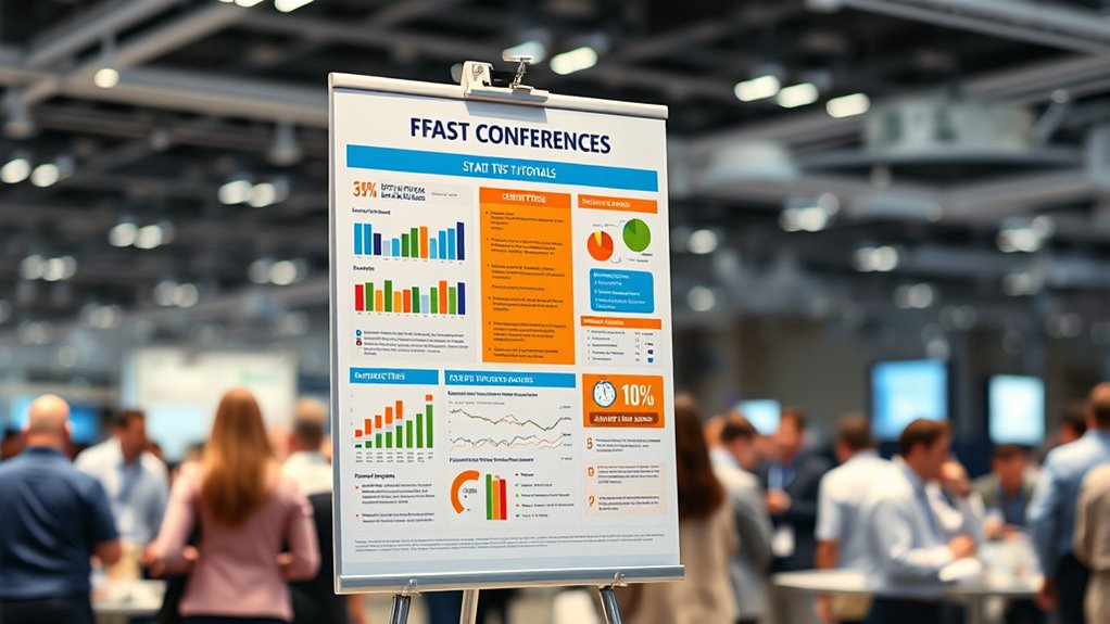
Presenting a conference poster can be intimidating, especially when it comes to effectively communicating your statistical findings. Your goal is to quickly capture attention and clearly convey your key results, which means mastering the art of data visualization. Well-designed visuals are powerful tools—they can turn complex datasets into easily digestible insights. Use graphs, charts, and infographics strategically to highlight your main findings. For example, a bar chart comparing groups or a scatter plot showing correlations instantly tells a story that words alone often can’t. Keep your visuals simple, uncluttered, and focused on the message you want to deliver. When viewers see your data visualization, they should grasp the core idea immediately, without needing to decipher complicated details. Remember that clarity in your visuals directly impacts how effectively you communicate statistical significance. If you’ve found significant differences or relationships, make those stand out—use contrasting colors, clear labels, and annotations to emphasize these points. Highlighting statistical significance helps your audience understand which results are meaningful and worth attention. Don’t overload your poster with too many visuals; instead, select the most impactful ones that reinforce your key findings. When presenting p-values or confidence intervals, use visual cues like asterisks or shaded areas to clearly indicate significance levels. This not only makes your results more accessible but also demonstrates rigor in your analysis. Keep in mind that your visuals should complement your narrative, not replace it. Brief, clear explanations alongside your charts guide viewers through the story your data tells. Practice explaining your visuals succinctly—be ready to point out the significance and what it implies for your research. Ultimately, effective data visualization is about making complex statistical results approachable and engaging. It ensures that your audience can quickly understand the importance of your work, especially the aspects related to statistical significance. With thoughtful visuals and clear emphasis on key findings, you’ll boost the impact of your poster and leave a lasting impression. So, focus on designing visuals that speak loudly and clearly, making your statistical insights accessible at a glance. By doing so, you’ll elevate your presentation and ensure your research resonates with viewers, no matter how busy the conference hall gets. Remember that color accuracy and clear contrast are essential components of effective visual communication in data presentation.
Frequently Asked Questions
How Can I Make My Poster Stand Out Visually?
To make your poster stand out visually, focus on creating strong color contrast to draw attention and improve readability. Use a clear visual hierarchy by varying font sizes and boldness to guide viewers through your key points. Keep your design simple and uncluttered, emphasizing essential information. Incorporate eye-catching visuals and consistent color schemes to maintain interest. This approach guarantees your poster captures attention and communicates your message effectively.
What Software Is Best for Designing Conference Posters?
You might find that software like Canva or Adobe InDesign offers excellent tools for designing conference posters. They allow you to experiment with color schemes and font choices easily, helping your poster stand out without overwhelming your audience. These programs are user-friendly and flexible, making it simple to create visually appealing layouts. By choosing the right software, you’ll craft a professional poster that effectively communicates your ideas and captures attention effortlessly.
How Should I Prepare My Speech for Poster Presentation?
To prepare your speech for a poster presentation, focus on crafting effective storytelling that highlights your key findings clearly and concisely. Practice your delivery to guarantee it’s engaging, maintaining eye contact and using a confident tone. Keep your explanation brief but informative, and anticipate questions. Rehearse multiple times, refining your message and timing so you can deliver an engaging presentation that captures your audience’s attention.
What Are Common Mistakes to Avoid in Poster Stats?
When presenting poster stats, you should avoid common mistakes like statistical misinterpretations and data overfitting. Don’t overstate your findings or draw conclusions that aren’t supported by your data. Guarantee your analyses are clear and accurate, avoiding cherry-picking results. Present your stats transparently, so viewers trust your work. Being honest about limitations and avoiding complex jargon helps prevent miscommunication and keeps your poster compelling and credible.
How Do I Handle Questions During the Poster Session?
When handling questions during your poster session, stay calm and attentive. Listen carefully to each question, and if you’re unsure, ask for clarification rather than guessing. Provide clear, concise, and confident responses, emphasizing your key findings. If a question is off-topic, politely steer the conversation back. Remember, effective responses demonstrate your expertise and engagement, making a positive impression and fostering meaningful discussions with your audience.
Conclusion
By applying these quick tips, you’ll transform your conference poster into a lighthouse guiding viewers through your data with clarity and impact. Remember, clarity is your compass, and visuals are your navigational stars. With a confident stride and polished stats, your poster will stand out like a beacon in a sea of information. So, embrace these strategies, and watch your research shine brighter than ever, illuminating paths for new collaborations and ideas.