
To quickly understand SPSS output, focus on key sections like coefficients, significance levels, and means. Use clear headings to locate your results easily, and interpret p-values to determine if your findings are statistically significant. Look at coefficients to assess the strength and direction of relationships. Keep your analysis organized and simple, and you’ll get insights faster. Continue exploring these tips to uncover more effective ways to interpret your SPSS results efficiently.
Key Takeaways
- Focus on understanding the structure and meaning of SPSS tables, including coefficients and p-values.
- Learn to interpret key statistics to quickly assess the significance and strength of results.
- Use clear, organized report templates to streamline output presentation and analysis.
- Practice reading tables carefully to connect statistical findings with research questions.
- Develop quick-reference guides highlighting common SPSS output components and their interpretations.

Are you struggling to interpret SPSS output? You’re not alone. Many people find the raw data and complex tables overwhelming at first. The key to making sense of your results is mastering data interpretation, which involves understanding what each statistic means and how it relates to your research questions. Once you’ve grasped the basics, report formatting becomes much easier. Properly formatted reports highlight your findings clearly and professionally, making it easier for others to understand your work.
The first step is to familiarize yourself with the structure of SPSS output. When you run an analysis, SPSS generates tables containing coefficients, significance values, means, and other statistics. Instead of getting lost in the numbers, focus on what they represent. For example, p-values indicate whether your results are statistically significant, while coefficients tell you about the strength and direction of relationships. Developing the skill of data interpretation involves asking yourself questions like: Does this coefficient make sense? Is the significance level below my threshold? Is the pattern consistent with my hypothesis? Practice reading each table carefully, and over time, you’ll find it easier to extract meaningful insights.
Another important aspect is understanding the statistics provided in the output, which helps in drawing accurate conclusions from your data. Report formatting is equally important because it ensures your findings are communicated effectively. Start by organizing your results into clear sections, such as descriptive statistics, inferential tests, and conclusions. Use headings and subheadings to guide readers through your analysis. When presenting tables, make sure they are labeled accurately, include relevant notes, and are formatted consistently. Avoid clutter by only including essential information, and use plain language to explain what each result means in plain English. Remember, your goal is to make your report accessible, so someone unfamiliar with your dataset can follow your logic.
To streamline the process, consider creating a template for your reports. This template can include predefined sections, formatting styles, and standard notes for interpreting results. This way, each new report becomes quicker to prepare, and your presentation remains professional. Also, leverage the built-in options in SPSS for exporting tables in formats compatible with word processors, which helps maintain consistent formatting throughout your report.
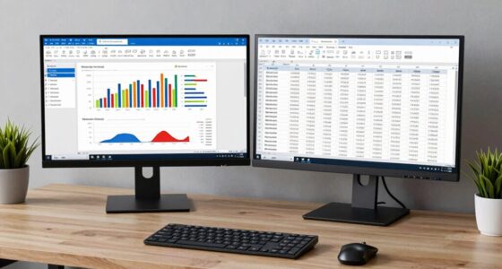
SPSS output analysis guide
As an affiliate, we earn on qualifying purchases.
As an affiliate, we earn on qualifying purchases.
Frequently Asked Questions
How Do I Interpret Complex SPSS Output Tables?
When interpreting complex SPSS output tables, focus on statistical significance by checking p-values—values below 0.05 usually indicate significance. Look at confidence intervals to understand the range within which true effects likely fall. Pay attention to the coefficients and their standard errors, and consider how these elements relate to your hypotheses. This approach helps you make informed conclusions from your data, ensuring you understand the key findings effectively.
Can I Customize SPSS Output Formatting?
Yes, you can customize formatting and output styles in SPSS to suit your needs. You customize formatting by adjusting font styles, colors, and cell alignments directly within tables. You also modify output styles through the SPSS Output Viewer, where you can change themes, font sizes, and colors. These options help you create clear, professional-looking tables that effectively communicate your data insights, making your analysis more impactful and tailored to your presentation needs.
How to Export SPSS Output to Other Formats?
You can easily export SPSS output to other formats using the export options. First, open your output window, then go to ‘File’ > ‘Export’. You’ll see various file formats like PDF, Word, Excel, and HTML. Select your preferred format, choose the destination folder, and click ‘OK’. This process allows you to efficiently save and share your analysis results in the most suitable file formats.
What Are Common Errors in SPSS Output Interpretation?
Think of SPSS output as a map, guiding your research journey. Common errors include misinterpreting data due to overlooking significance levels or confidence intervals, leading to data misinterpretation. Formatting errors, like inconsistent labels or missing values, can distort your understanding. Always double-check your tables and graphs, ensuring clarity. By doing so, you prevent missteps on your path, making your analysis accurate and your conclusions trustworthy.
How to Troubleshoot Missing or Incomplete SPSS Output?
When facing missing or incomplete SPSS output, you should start by checking your data for errors through data cleaning, making certain no missing values or inconsistencies. Next, review your syntax for any mistakes. Use output visualization to identify where issues occur, and rerun your analyses if needed. Saving your output regularly helps prevent data loss. These steps help troubleshoot effectively and ensure your results are complete and accurate.
statistical report templates for SPSS
As an affiliate, we earn on qualifying purchases.
As an affiliate, we earn on qualifying purchases.
Conclusion
Mastering SPSS output might seem intimidating at first, but with practice, you’ll see it’s not as rocket science as it looks. Keep experimenting and referring to tutorials like this one, because every little step gets you closer to confidence. Remember, Rome wasn’t built in a day, so don’t get discouraged if things don’t click immediately. Stick with it, and soon you’ll be turning out professional-looking reports like a seasoned pro.
professional data analysis report software
As an affiliate, we earn on qualifying purchases.
As an affiliate, we earn on qualifying purchases.
SPSS table export tools
As an affiliate, we earn on qualifying purchases.
As an affiliate, we earn on qualifying purchases.