

To use color effectively in data visualization, select palettes that match your data type and purpose, such as sequential for magnitude and diverging for deviations. Make certain colors are accessible and culturally appropriate to avoid misunderstandings. Use consistent colors across visuals to help viewers quickly interpret categories and trends. Thoughtfully applied colors enhance clarity, evoke emotions, and strengthen storytelling. Keep exploring these principles to create more impactful visualizations that communicate your insights clearly and respectfully.
Key Takeaways
- Choose appropriate color schemes (sequential, diverging) to enhance data interpretation and highlight key insights.
- Ensure colors are accessible and distinguishable for viewers with color vision deficiencies.
- Use consistent colors across visualizations to improve clarity and facilitate comparison.
- Align color choices with emotional tone and cultural contexts to effectively communicate the intended message.
- Apply colors purposefully to differentiate categories, show trends, and guide viewer attention.
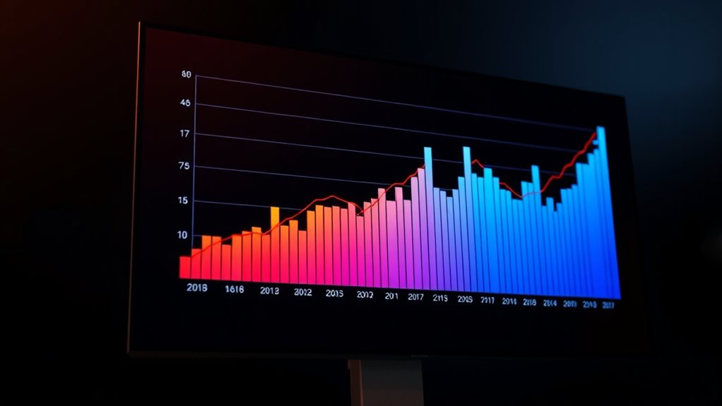
Using color effectively in data visualization can considerably enhance a viewer’s understanding and engagement. One of the first steps you should take is carefully considering your color palette selection. The right palette can make your data easy to interpret, guiding viewers’ attention to key insights without overwhelming them. A well-chosen palette balances contrast and harmony, ensuring that each color serves a purpose. For example, using a sequential color scheme for continuous data helps viewers grasp the magnitude of values quickly, while diverging palettes are ideal for highlighting deviations from a central point. When selecting colors, keep in mind accessibility—use color combinations that are distinguishable for those with color vision deficiencies, such as avoiding red-green pairings that can be problematic for some viewers. Additionally, understanding the health benefits associated with certain natural products can inform the use of colors that evoke trust and wellness, enhancing the emotional impact of your visualization. Beyond technical considerations, understanding cultural color interpretations is vital. Colors carry different meanings across cultures, and misusing them can lead to confusion or misinterpretation. For instance, red might symbolize luck and prosperity in China but could represent danger or warning in Western contexts. Similarly, white often signifies purity in Western cultures but is associated with mourning in some Asian countries. When designing visualizations for diverse audiences, it’s essential to choose colors that align with the viewers’ cultural expectations or to provide clear context that clarifies the intended message. This awareness helps prevent misunderstandings and guarantees your data is communicated accurately and respectfully. Another important aspect is consistency. Once you’ve selected a color palette that resonates well with your audience and suits your data type, stick to it throughout the visualization. Inconsistent use of colors can confuse viewers, making it harder for them to follow your story. Use colors intentionally to differentiate categories, emphasize trends, or show relationships. For example, assign specific colors to particular groups and maintain those associations across all charts and dashboards. This consistency helps viewers develop a mental map, making the data easier to process and compare. Lastly, consider the emotional impact of your color choices. Colors evoke feelings and reactions—blue often conveys trust and calm, while orange can generate enthusiasm. By aligning your palette with the emotional tone you want to set, you can subtly influence how your audience perceives and engages with your data. Overall, thoughtful color palette selection and awareness of cultural interpretations are foundational to creating compelling, clear, and respectful data visualizations that truly communicate your insights.
color palette for data visualization
As an affiliate, we earn on qualifying purchases.
As an affiliate, we earn on qualifying purchases.
Frequently Asked Questions
How Does Color Blindness Affect Data Visualization Choices?
Color blindness notably impacts your data visualization choices because many viewers can’t distinguish certain colors. You need to take into account color vision and follow accessibility standards to guarantee your visuals are inclusive. Using color palettes with high contrast and avoiding problematic color combinations helps everyone interpret data accurately. By prioritizing accessibility, you make your visualizations more effective and ensure they communicate your message clearly to all audiences.
Which Color Schemes Are Best for Printing vs. Digital Displays?
Choosing color schemes is like picking the right shoes for the journey. For print, you should opt for print-friendly palettes with high contrast and limited color variations to guarantee clarity. For digital displays, use vibrant digital display colors that look sharp on screens and take advantage of backlit displays. This way, your data remains clear and engaging, whether on paper or a screen.
How Can I Ensure Color Accessibility Across Diverse Audiences?
To guarantee color accessibility across diverse audiences, you should consider color symbolism and choose colors that convey clear, universal meanings. Conduct accessibility testing using tools like color contrast analyzers to verify readability for all users, including those with color vision deficiencies. Avoid relying solely on color to communicate crucial information, and incorporate patterns or labels. This approach guarantees your visualization remains effective and inclusive for everyone.
What Are Common Pitfalls When Pairing Multiple Colors?
You risk chaos and confusion if you pair too many colors, creating a color overload that overwhelms viewers. Beware of inconsistent palette choices that clash and distract, making your data hard to interpret. Using too many hues or mismatched shades dilutes clarity and hampers accessibility. Instead, stick to a cohesive, limited color palette, ensuring each color serves a purpose, keeping your visualization clear, accessible, and visually harmonious.
How Do Cultural Differences Influence Color Interpretation?
You should consider that cultural symbolism and regional preferences shape how people interpret colors. For example, red might symbolize luck in China but danger in Western cultures. When designing visualizations, tailor your color choices to your audience’s cultural background to avoid misinterpretation. Research regional symbolism and preferences beforehand, ensuring your message resonates clearly and respectfully across diverse cultural groups.
accessible color schemes for charts
As an affiliate, we earn on qualifying purchases.
As an affiliate, we earn on qualifying purchases.
Conclusion
As you craft your visuals, imagine color as a brushstroke guiding your audience through a vibrant, clear story. With thoughtful choices, you paint data that pops and whispers, revealing insights at a glance. When you harness color wisely, you turn complex numbers into a breathtaking mural of understanding. So, choose your hues intentionally—let your visualization glow with purpose, illuminating every detail and inviting viewers to see your story in a whole new light.
diverging and sequential color palettes
As an affiliate, we earn on qualifying purchases.
As an affiliate, we earn on qualifying purchases.
color blind friendly data visualization tools
As an affiliate, we earn on qualifying purchases.
As an affiliate, we earn on qualifying purchases.