

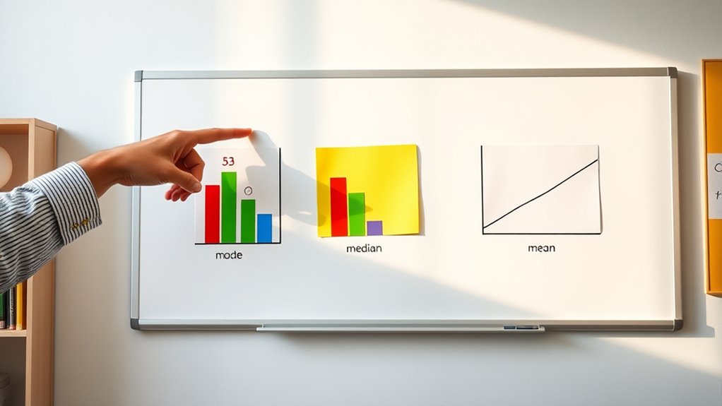
The mean is what most people call the average, found by adding all values and dividing by how many there are. The median is the middle number when you line up all your data from smallest to largest. The mode is the value that shows up most often. Each helps you understand your data better and spot patterns or outliers. If you keep exploring, you’ll discover how these tools can make analyzing data easier and more meaningful.
Key Takeaways
- The mean is the average of all data points, found by adding values and dividing by the number of items.
- The median is the middle value when data is ordered from smallest to largest; it splits the dataset into two equal halves.
- The mode is the most frequently occurring value in a dataset, which shows the most common item or number.
- The mean can be affected by extreme values (outliers), while the median is more resistant to such skewness.
- These measures help summarize and understand data patterns, making it easier to interpret large or complex datasets.
Understanding the concepts of mean, median, and mode is essential for analyzing data effectively. When you’re working with numbers, whether it’s for a school project, a business report, or personal decisions, knowing these measures helps you interpret what the data actually tells you. In the world of data visualization and statistical analysis, these concepts serve as foundational tools that make complex information more understandable. They help you identify patterns, spot outliers, and summarize large datasets in ways that are easy to grasp. Without them, interpreting data can feel like trying to find your way in a fog—you might get lost or miss important insights.
The mean, often called the average, is probably the most familiar measure. To find it, you add up all the values in your dataset and then divide by the number of data points. For example, if you’re analyzing test scores, summing all scores and dividing by the total number of students gives you the mean score. It provides a quick snapshot of the central tendency, but it can be skewed by extremely high or low values, known as outliers. That’s why, in statistical analysis, you always consider the context and distribution of your data before relying solely on the mean. Using data visualization tools like histograms or box plots can help you see how the mean relates to the overall data spread, so you get a clearer picture of what the average truly represents.
The median differs from the mean in that it focuses on the middle value when your data is ordered from smallest to largest. If you have an odd number of data points, the median is simply the middle one. With an even number, it’s the average of the two middle values. The median is particularly useful when your dataset contains outliers or is skewed because it isn’t pulled in the direction of extreme values like the mean can be. For instance, if you’re analyzing household incomes, a few very high incomes might inflate the mean, but the median will give you a better sense of what a typical household earns. In statistical analysis, the median helps you understand the central location of your data without being overly affected by outliers. Data visualization, like box plots, often highlights the median as a key feature, helping you see the data’s symmetry and spread clearly. Recognizing the distribution of data is crucial for choosing the most appropriate measure of central tendency.
The mode is the most frequently occurring value in your dataset. It’s especially useful when dealing with categorical data or identifying popular items. For example, in a survey asking for favorite colors, the mode reveals the most common choice. Unlike the mean and median, the mode doesn’t rely on numerical calculations but instead on frequency. Sometimes, a dataset can have more than one mode, known as bimodal or multimodal distributions, indicating multiple common values. In data visualization, bar charts or frequency tables are excellent for displaying modes, making it easy to spot the most common data points. Overall, understanding the mode helps you identify what’s typical or popular within your data, offering insights that other measures might overlook.
Mastering these concepts makes your statistical analysis sharper and your data visualizations more meaningful. By knowing when to use mean, median, or mode, you can draw more accurate conclusions and present your findings clearly.
Frequently Asked Questions
How Do I Calculate Mean, Median, and Mode With Grouped Data?
When working with grouped data, you estimate the mean by finding the midpoint of each class, multiplying it by the frequency, and dividing the sum by total data points. For the median, identify the class where the middle value falls, then interpolate within that class. To find the mode, look for the class with the highest frequency. These steps help you interpret histograms more accurately and analyze grouped data effectively.
Can the Mean, Median, and Mode All Be the Same Number?
Imagine a classroom where every student scores exactly 85—your data comparison shows all three measures align perfectly. Yes, the mean, median, and mode can all be the same number, indicating a symmetric distribution with a single, central value. This makes statistical interpretation straightforward, as it suggests the data is evenly spread around that common point, giving you a clear picture of the dataset’s center.
What Is the Significance of the Mode in Data Analysis?
The significance of the mode in data analysis is that it helps you identify the most common value, which indicates data consistency or highlights anomalies. If the mode stands out, it suggests a pattern or trend, making it easier to detect unusual data points. By focusing on the mode, you can better understand the distribution and guarantee your data remains reliable and accurate for decision-making.
How Do Outliers Affect the Mean, Median, and Mode?
Outlier impact can substantially influence your data analysis, especially affecting the mean by pulling it toward extreme values. The median remains relatively stable, as it depends on the middle data point. The mode is least affected by outliers, but if outliers are frequent, they can create false modes. Overall, outliers increase data variability, making it important to identify and manage them for accurate insights.
Which Measure Is Best for Skewed Distributions?
When dealing with skewed distributions, you should choose the median because it’s less affected by skewness impact. The shape of the distribution makes the mean unreliable, as it gets pulled toward the tail. The median better reflects the typical value in skewed data, providing a more accurate measure of central tendency. So, for skewness impact, the median is your best choice to understand the data’s true center.
Conclusion
By understanding the subtle nuances of mean, median, and mode, you gain a clearer picture of data’s story. These concepts gently guide you through the complexities, allowing you to interpret information with confidence. As you apply this knowledge, remember that every dataset has its own quiet elegance, waiting for you to uncover. Embrace these tools, and you’ll find yourself steering numbers with a touch of finesse, revealing insights that might otherwise go unnoticed.