
To build effective dashboards, focus on creating a clear visual hierarchy that highlights key insights immediately. Use size, color, contrast, and placement strategically to guide users effortlessly through complex data sets. Simplify layouts by grouping related information and avoiding clutter, making it easy to interpret. Incorporate interactive elements and prioritize essential data while downplaying less critical details. Mastering these principles will help you design dashboards that communicate effectively—if you continue exploring, you’ll discover ways to refine your approach even further.
Key Takeaways
- Prioritize critical data using size, boldness, and color to establish a clear visual hierarchy.
- Organize information logically with grouping and intuitive layout for easy navigation.
- Balance data density by combining concise visuals and interactive elements to prevent clutter.
- Use consistent visual cues, labels, and contrast to enhance comprehension and quick insight.
- Design with a user-centric approach, promoting exploration, analysis, and confident decision-making.
Have you ever wondered what makes a dashboard truly effective? It all comes down to how well it communicates information at a glance, guiding users smoothly through complex data sets. The secret lies in establishing a strong visual hierarchy. When you design a dashboard with a clear visual hierarchy, you prioritize the most critical data, making it instantly recognizable and easy to interpret. You do this by using size, color, contrast, and placement strategically. Larger, bolder elements naturally draw attention first, signaling their importance. Bright colors can highlight key metrics, while subdued shades keep less critical data in the background. Grouping related information and arranging items logically helps users navigate intuitively, reducing confusion and cognitive overload. An effective visual hierarchy also involves understanding how to discover home décor inspiration and interior design tips, ensuring your dashboard remains engaging and relevant to your audience.
Creating an effective visual hierarchy directly impacts user engagement. When users are engaged, they’re more likely to explore the dashboard thoroughly, derive insights, and make informed decisions. To foster this engagement, you want the design to be not only visually appealing but also functional. Incorporate consistent visual cues so users immediately understand the significance of each element. For example, using a common color scheme for alerts, warnings, and positive indicators helps users quickly grasp the context. Clear labels, concise data presentation, and uncluttered layouts prevent distraction and keep focus on what matters most.
Another way to boost user engagement is by balancing information density with simplicity. Avoid overwhelming your users with excessive data or overly complex visuals. Instead, aim for a clean, streamlined interface that highlights key insights without sacrificing detail. Break down large datasets into digestible chunks, like charts or summaries, making it easier for users to process information efficiently. Interactive elements—such as filters or drill-down options—invite users to explore data further, making the experience more dynamic and personalized. When users feel in control of the data they’re viewing, their engagement naturally increases.
In essence, effective dashboard design hinges on thoughtful visual hierarchy and user-centric layout. When you master this balance, you create dashboards that are not only visually compelling but also highly functional, encouraging users to interact, analyze, and act confidently. Your goal should be to craft a visual experience that guides users effortlessly toward key insights, ensuring they stay engaged and make smarter decisions based on clear, well-organized data.
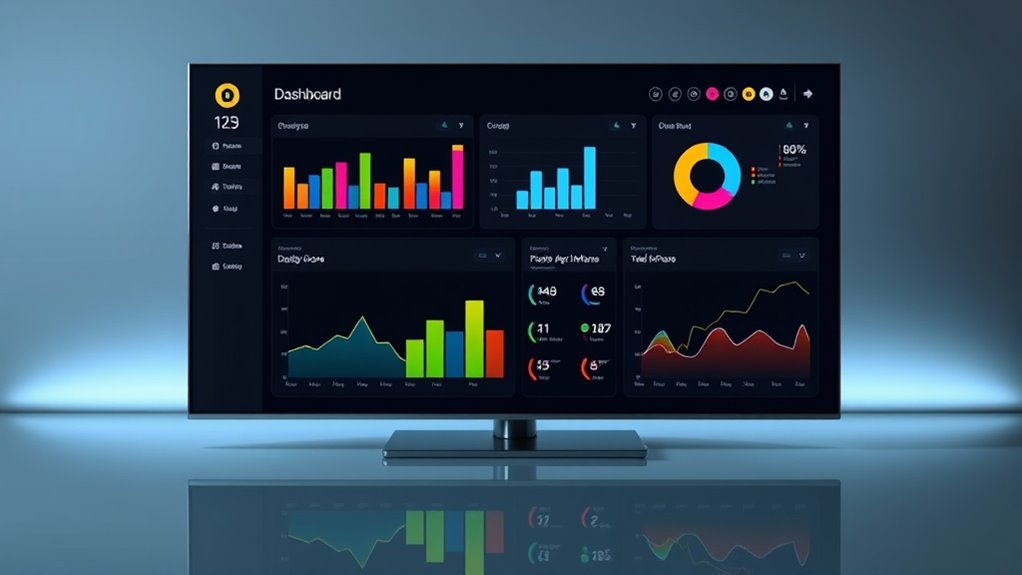
dashboard monitor with adjustable height
As an affiliate, we earn on qualifying purchases.
As an affiliate, we earn on qualifying purchases.
Frequently Asked Questions
How Do I Choose the Right Data Metrics for My Dashboard?
To choose the right data metrics for your dashboard, focus on data relevance and metric selection. Identify your goals and ask which metrics best reflect your key performance indicators. Avoid clutter by selecting only the most meaningful data that provides clear insights. Continuously evaluate and adjust your metrics to guarantee they align with your evolving objectives, helping you make informed decisions quickly and effectively.
What Tools Are Best for Creating Interactive Dashboards?
Did you know that 80% of users find interactive dashboards increase engagement? For creating such dashboards, tools like Tableau, Power BI, and Google Data Studio are excellent choices. They excel at data visualization, making complex data accessible and engaging. These tools allow you to add filters, drill-downs, and interactive charts, boosting user engagement and helping you communicate insights effectively. Choose one based on your data needs and technical comfort.
How Can I Ensure My Dashboard Is Accessible to All Users?
You can guarantee your dashboard is accessible by using high color contrast to make text and visuals easily readable for everyone. Incorporate keyboard navigation so users can navigate without a mouse, making it inclusive for those with mobility impairments. Test your dashboard with accessibility tools, gather feedback from diverse users, and follow WCAG guidelines. These steps help create an inclusive experience, ensuring all users can access and understand your data effectively.
What Are Common Pitfalls to Avoid in Dashboard Design?
To avoid common pitfalls, steer clear of visual clutter that overwhelms users and makes data hard to interpret. Avoid misleading visuals, like distorted scales or inappropriate chart types, which can misrepresent information. Keep your design clean and focused, prioritizing clarity and simplicity. Regularly test your dashboard with users to identify confusing elements. By doing so, you guarantee your dashboard remains effective, accurate, and user-friendly.
How Often Should I Update or Review Dashboard Content?
Think of your dashboard as a living organism—constantly evolving with real-time updates. You should review and update your content regularly, ideally daily or weekly, depending on how fast your data changes. Keep an ear to user feedback, as it guides you to refine and improve. This ongoing rhythm guarantees your dashboard stays relevant and insightful, empowering you to make quick, informed decisions every step of the way.
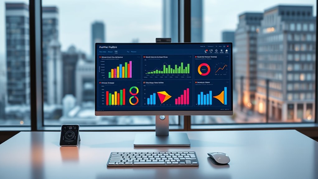
ergonomic computer desk for data analysis
As an affiliate, we earn on qualifying purchases.
As an affiliate, we earn on qualifying purchases.
Conclusion
Master these dashboard design principles, and you’ll turn your data into a powerhouse of insight — so impactful, it’ll practically run your entire business! With clear visuals and intuitive layouts, you’ll transform chaos into clarity faster than you can say “data-driven decision.” Ignore these tips, and your dashboards might just cause confusion, frustration, and missed opportunities. So, embrace these principles now, and watch your dashboards become the superhero tool you never knew you needed!

Hands-On Data Visualization: Interactive Storytelling From Spreadsheets to Code
As an affiliate, we earn on qualifying purchases.
As an affiliate, we earn on qualifying purchases.
color-coded LED indicator lights
As an affiliate, we earn on qualifying purchases.
As an affiliate, we earn on qualifying purchases.