
When visualizing uncertainty, error bars and confidence bands serve different purposes. Error bars show the variability or measurement precision for individual data points, helping you see how consistent or spread out the data is. Confidence bands, on the other hand, illustrate the likely range of true values or model predictions, indicating the level of uncertainty in your estimates. Understanding how both tools work can help you interpret your data more accurately–exploring further will give you a clearer picture.
Key Takeaways
- Error bars display data variability and measurement precision on individual data points or summaries.
- Confidence bands illustrate the uncertainty around estimated parameters or model predictions.
- Narrow error bars indicate high measurement accuracy, while wide ones suggest greater variability.
- Confidence bands show the range within which true values or model estimates are likely to fall.
- Both tools help interpret data reliability and the degree of uncertainty in visualizations.

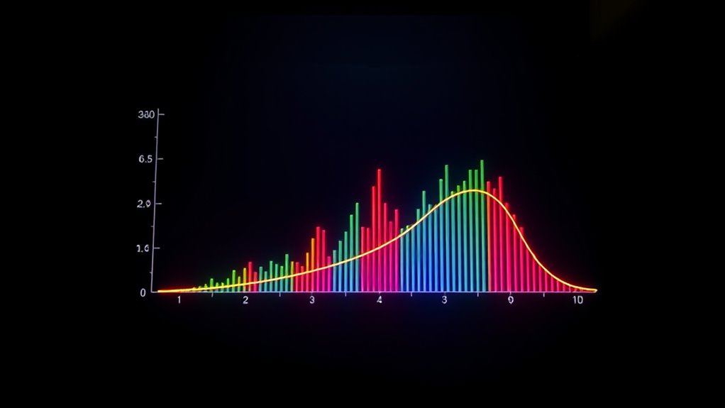
When interpreting data visualizations, understanding the difference between error bars and confidence bands is vital. These tools help you grasp the underlying uncertainty in your data, but they serve different purposes and convey different types of information. Error bars primarily focus on measurement precision and data variability within a dataset, giving you a snapshot of how consistent your measurements are and how much they fluctuate. Confidence bands, on the other hand, reflect the uncertainty associated with estimated parameters or model predictions, providing a range within which the true value is likely to fall with a specific probability. Additionally, understanding the coverage area of an air purifier can help determine how well it addresses your specific room size and air quality needs. Error bars are typically used to display the variability or spread of individual data points around a mean or median. When you see error bars on a bar chart or scatter plot, they indicate the degree of measurement precision and the extent of natural data variability. For example, if you’re measuring the height of plants across different samples, the error bars might show the standard deviation or standard error, helping you understand how consistent your measurements are and whether differences between groups are meaningful. Essentially, shorter error bars suggest less measurement variability and higher precision, while longer error bars indicate greater variability, meaning your data points are more spread out or less reliable. Confidence bands, by contrast, are generally associated with statistical estimates or model fits. They illustrate the range within which the true population parameter or predicted value is expected to lie, given a certain confidence level—often 95%. When you look at a regression line with confidence bands, for instance, those bands show the degree of uncertainty in the model’s predictions. If the bands are narrow, you can be relatively confident that your estimated trend accurately captures the relationship in the data. Wide confidence bands, however, signal greater uncertainty, often due to limited data, high variability, or a weak model fit. This distinction is vital because confidence bands help you assess the reliability of your inferences, not just the variability in your raw measurements.
error bars for data visualization
As an affiliate, we earn on qualifying purchases.
As an affiliate, we earn on qualifying purchases.
Frequently Asked Questions
How Do I Choose Between Error Bars and Confidence Bands?
You should choose error bars when you want quick, clear visual cues for specific data points, especially if your data meets the statistical assumptions required for accurate error bar representation. Confidence bands are better when you need a thorough view of the entire data trend and want to communicate the uncertainty around a fitted model or curve. Consider visual clarity and the nature of your data to make the best choice.
Can These Visualizations Be Used for Non-Parametric Data?
Yes, you can use error bars and confidence bands for non-parametric data. These visual representations work with non-parametric techniques because they don’t rely on strict distribution assumptions. Error bars can show variability or uncertainty in median estimates, while confidence bands can illustrate the range of possible values in non-parametric models like kernel density estimates or bootstrap distributions. They provide clear visual cues, helping you interpret data uncertainty effectively.
What Are Common Misinterpretations of Error Visuals?
You should be aware that misinterpretation risks exist with error visuals like error bars and confidence bands. People often assume the error bars represent variability in individual data points rather than the uncertainty of the estimate, which can mislead your understanding. To guarantee visual clarity, clearly explain what the error visuals signify, and avoid overgeneralizing their meaning. Accurate interpretation depends on understanding these common pitfalls and communicating them effectively.
How Do Sample Size and Variability Affect These Plots?
You should know that sample size impacts error visuals by making them more precise with larger samples, reducing uncertainty. Variability effects show that higher variability broadens error bars or confidence bands, indicating less certainty. Smaller samples or high variability can mislead you into overestimating or underestimating the true data trend. Always consider these factors when interpreting error visuals to get a clearer, more accurate understanding of the data’s reliability.
Are There Software Tools That Automatically Generate These Visuals?
You can use software like R with ggplot2 or Python’s Matplotlib for automated visualization of error bars and confidence bands. For example, in a clinical trial, these tools automatically generate visuals showing treatment effect uncertainty, making it easier to interpret results. These tools integrate seamlessly into data analysis workflows, saving time and reducing errors, so you can focus on insights rather than manual plotting.
confidence bands for regression analysis
As an affiliate, we earn on qualifying purchases.
As an affiliate, we earn on qualifying purchases.
Conclusion
By now, you see how error bars and confidence bands help you understand data’s uncertainty. They reveal where your estimates might vary, guiding better decisions. Don’t you want to communicate your findings clearly and accurately? Remember, visualizing uncertainty isn’t just about numbers—it’s about honesty and transparency in your analysis. So, next time you present data, ask yourself: are you truly showing the full story? Clear visuals make your conclusions stronger and more trustworthy.
statistical graph error bars
As an affiliate, we earn on qualifying purchases.
As an affiliate, we earn on qualifying purchases.
visualizing uncertainty in data plots
As an affiliate, we earn on qualifying purchases.
As an affiliate, we earn on qualifying purchases.