
Histograms and bar charts are key tools for showing data distributions and category comparisons. Histograms display the frequency of continuous data by grouping values into bins, revealing patterns like skewness or outliers. Bar charts compare categories directly by representing their counts or percentages with bars. Understanding when to use each helps you interpret your data more effectively, and if you keep exploring, you’ll discover how these visuals truly enhance your analysis skills.
Key Takeaways
- Histograms display the frequency distribution of continuous data by grouping data into bins, revealing data shape and spread.
- Bar charts compare categorical data directly, with each bar representing a category’s count or frequency.
- Proper bin width selection in histograms balances detail and noise, crucial for accurate data distribution insights.
- Histograms highlight data skewness, modality, and outliers, aiding in understanding the overall distribution pattern.
- Bar charts facilitate comparison across groups or categories, clarifying differences without data binning.
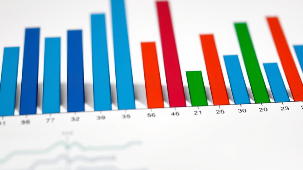
Histograms and bar charts are two common types of visual tools used to represent data clearly and effectively. They help you see patterns, understand distributions, and communicate insights quickly. When working with large datasets, these charts become invaluable because they simplify complex information into an easy-to-interpret visual format. Whether you’re analyzing survey results, sales figures, or experimental data, understanding how to use these tools properly can make a big difference in your analysis.
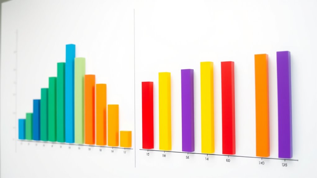
Histograms are particularly useful for visualizing the frequency distribution of continuous data. They group data points into intervals called bins, a process known as data binning. By doing this, histograms display how often data points fall within each bin, giving you an immediate sense of the data’s shape—whether it’s skewed, symmetric, or bimodal. When you create a histogram, selecting the right bin width is essential, because too wide a bin can hide details, while too narrow can make the chart look noisy. The goal is to find a balance that accurately reflects the underlying distribution. This visual representation allows you to quickly identify where most data points lie, spot outliers, and understand the spread of your data.
Histograms reveal data shape by grouping continuous data into intervals called bins.
Bar charts, on the other hand, are typically used for categorical data. They display the frequency or count of items within specific categories, making them perfect for comparing different groups. For example, if you want to compare sales across regions or customer preferences across product types, bar charts provide a clear visual comparison. Unlike histograms, bar charts don’t require data binning because each bar represents a discrete category. The height of each bar corresponds to the frequency, making it easy to see which categories are most or least common. This straightforward approach helps you communicate differences among groups effectively, especially when categories are non-numeric or nominal.
Both histograms and bar charts rely on the concept of frequency distribution to convey how data points are spread across various intervals or categories. They transform raw numbers into visual summaries that are easier to interpret at a glance. While histograms focus on the distribution of continuous data through data binning, bar charts excel at showing comparisons among categories. By choosing the right chart type for your data, you enhance your ability to analyze and share insights clearly. Mastering these visual tools will empower you to make informed decisions based on the data patterns you uncover.
Frequently Asked Questions
How Do I Choose Between a Histogram and a Bar Chart?
You should choose a histogram when you want to visualize data distribution and understand data granularity, especially with continuous data. Opt for a bar chart when comparing categories or discrete groups where visualization aesthetics matter. Consider how detailed you need the data presentation to be; histograms show frequency, while bar charts highlight differences between distinct groups. Your choice depends on whether you focus on distribution or category comparison.
Can Histograms Display Categorical Data?
Imagine you’re a time traveler from the 1800s, but histograms can’t display categorical data. They have categorical limitations because they’re designed to show data distribution, not specific categories. If you want to visualize data categorization clearly, bar charts are your best bet. Histograms excel at revealing the spread of continuous data, but for categories, stick with bar charts—they’re better suited for that purpose.
What Are Common Mistakes When Interpreting Bar Charts?
When interpreting bar charts, you should watch out for scale misinterpretation and axis distortion. If the y-axis isn’t starting at zero or is compressed, you might overestimate differences between categories. Also, check if the axis labels are clear and consistent. These mistakes can lead you to draw false conclusions about the data, so always examine the axes carefully before analyzing the chart’s message.
How Do I Determine the Appropriate Number of Bins for a Histogram?
To determine the appropriate number of bins for a histogram, start with bin calculation methods like Sturges’ rule or the square root choice. These help balance detail and visual clarity, preventing over- or under-smoothing data. Adjust the bin size based on your data’s spread and the story you want to tell. Aim for a clear, insightful visualization that accurately represents your data distribution without overwhelming or oversimplifying.
Are There Software Tools That Automatically Generate These Charts?
Yes, there are automatic chart generators and histogram software tools that make creating these charts simple. You just input your data, and the software automatically selects the best number of bins and generates the chart for you. Popular options include Excel, Google Sheets, and specialized tools like Tableau or R packages. These tools save you time and help guarantee your histograms accurately represent your data distribution.
Conclusion
So, next time you’re tempted to use a bar chart for data that’s grouped into ranges, remember: histograms are the true champions for showing data distributions. It’s ironic how the simplest choice—using bars for categories—can obscure the story your data wants to tell. By choosing wisely, you’ll guarantee your audience truly understands your data’s story. After all, what’s the point of visuals if they don’t reveal the real picture?