
Micro animations subtly guide your interactions, making dashboards more engaging and easy to navigate. They serve as visual cues that confirm actions, highlight important updates, and create a natural flow that feels intuitive. These tiny motions help you understand complex data quickly and reduce frustration by providing instant feedback. When you incorporate well-designed micro animations, your users stay motivated and confident. Keep exploring how these subtle touches can elevate your dashboard experience even further.
Key Takeaways
- Micro animations provide visual cues that guide user attention and clarify complex data within dashboards.
- They deliver immediate feedback on interactions, confirming actions and improving perceived system responsiveness.
- Subtle animations highlight updates or important elements, aiding data storytelling and prioritization.
- Enhancing natural interactions with smooth transitions fosters a more intuitive and engaging user experience.
- Overall, micro animations increase engagement, reduce user uncertainty, and make data dashboards more accessible and polished.
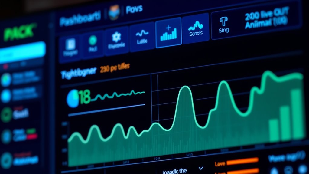
Have you ever noticed how small animations can make a big difference in user experience? When you’re working with dashboards, micro animations serve as subtle visual cues that guide your attention and clarify complex data. They’re like tiny signals that communicate status, transitions, and updates without overwhelming you. One of the key ways they do this is through well-designed feedback loops. When you interact with a dashboard—clicking a button, filtering data, or hovering over a chart—micro animations provide immediate, visual confirmation that your action has been registered. This instant feedback reassures you that the system is responsive, reducing uncertainty and frustration. For example, when you click a toggle switch, a quick animation might show the switch sliding into place, letting you know your choice has been applied. These feedback loops are vital because they keep you engaged and aware of what’s happening behind the scenes, making your experience seamless and intuitive. Additionally, incorporating quality ingredients such as fresh, seasonal flavors can make the overall experience more satisfying and memorable.
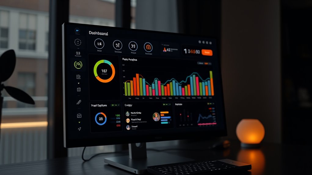
Visual cues are another fundamental aspect of micro animations. They subtly draw your eye to important elements or changes on the dashboard. Imagine a data point that pulses gently when it updates or a progress bar that fills smoothly as data loads. These cues help you prioritize what to look at without needing explicit instructions. They act as visual storytellers, guiding you through the data story that the dashboard presents. Micro animations also help in reducing cognitive load by breaking down complex processes into manageable visual steps. When you see a chart animate from one state to another, it’s easier to understand the transformation rather than trying to interpret static numbers or abrupt changes. This clarity improves your comprehension and keeps you engaged longer.
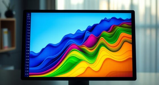
Moreover, micro animations foster a more dynamic user experience by making interactions feel more natural. Instead of static, unresponsive interfaces, you get a sense of flow that mimics real-world interactions. This sense of flow is reinforced by feedback loops and visual cues working together. They create a rhythm—an almost conversational tone—that makes the dashboard more inviting and less intimidating, especially when dealing with large datasets. The result is a user experience that feels both polished and user-friendly, encouraging you to explore deeper insights without hesitation. In summary, micro animations serve as the visual language of dashboards, communicating meaning quickly and effectively. They make sure your interactions are smooth, your understanding is clear, and your engagement remains high.
Frequently Asked Questions
How Do Micro Animations Impact Dashboard Load Times?
Micro animations can slightly impact dashboard load times, but if you focus on performance optimization, you can minimize delays. They enhance user perception by making interactions feel smoother and more intuitive. By ensuring animations are lightweight and strategically implemented, you prevent them from slowing down your dashboard. Ultimately, well-executed micro animations boost engagement without compromising performance, creating a more responsive and appealing user experience.
Are There Best Practices for Accessibility With Micro Animations?
Yes, there are best practices for accessibility with micro animations. You should prioritize high color contrast to guarantee visuals are clear for all users. Additionally, consider motion sensitivity by providing options to reduce or disable animations, helping users with vestibular disorders or motion sickness. Keep animations subtle and purposeful, avoiding unnecessary distractions. Testing your dashboard with accessibility tools ensures your micro animations are inclusive and enhance user experience for everyone.
Can Micro Animations Be Customized for Different User Roles?
Think of micro animations as a tailored suit for each user. You can customize these animations for different user roles, offering role-specific animations that match their needs and skills. This enables user personalization, making interactions more relevant and intuitive. By adapting animations to each role, you enhance engagement and efficiency, ensuring every user experiences a dashboard that feels designed just for them, boosting overall satisfaction and usability.
What Are Common Pitfalls When Implementing Micro Animations?
When implementing micro animations, you often face pitfalls like inconsistent animation styles, which can break user immersion. You might also cause user distraction if animations are overly flashy or poorly timed. To avoid these issues, guarantee animation consistency across your dashboard and keep animations subtle and purposeful. This way, you enhance engagement without overwhelming users or diverting their focus from key data.
How Do Micro Animations Influence User Decision-Making?
Did you know that micro animations can increase user decision-making speed by up to 20%? They influence your choices by directing your visual attention and evoking emotional responses. When used effectively, micro animations highlight important data points, making it easier for you to interpret information quickly. This emotional engagement keeps you interested, leading to more confident and informed decisions in your dashboard interactions.
Conclusion
Micro animations are the secret weapon that transforms dull dashboards into lively, engaging experiences. By adding subtle motion, you keep users hooked and make data feel alive—almost like a bustling cityscape pulsing with energy. When you harness their power, you turn static numbers into an interactive spectacle that captivates, educates, and delights all at once. Embrace micro animations, and watch your dashboards become the most vibrant, irresistible data playground imaginable!