
Data visualization is a essential tool for highlighting inequalities and disparities in society. It transforms complex data into clear, compelling visuals like maps and charts, making hidden issues visible and understandable. By engaging communities and ensuring algorithm transparency, you can foster trust, promote accountability, and inspire action. These visual stories help communicate critical social issues effectively, empowering you to create meaningful change. Keep exploring to discover how these strategies can amplify your impact even further.
Key Takeaways
- Visualizations reveal hidden disparities in income, healthcare, and education, making complex data accessible for advocacy and awareness.
- Transparent algorithms ensure accurate representation of inequalities, building trust and exposing biases in automated systems.
- Community engagement incorporates local context, fostering authentic storytelling and empowering marginalized groups to influence change.
- Interactive formats like maps and infographics enhance understanding, encouraging public participation and informed decision-making.
- Combining transparency with community involvement creates impactful visuals that promote accountability and drive social equity.

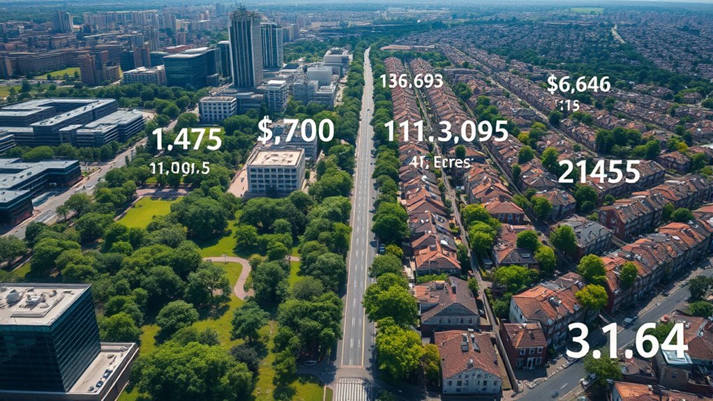
Data visualization has become a powerful tool for driving social change by transforming complex data into clear, compelling stories. When you leverage visual tools effectively, you can highlight inequalities and disparities that might otherwise remain hidden. For example, visual charts and maps can vividly display gaps in income, access to healthcare, or educational opportunities across different regions or populations. This clarity helps you communicate critical issues to a broader audience, inspiring action and fostering understanding.
One key aspect of effective data visualization in this context is guaranteeing algorithm transparency. When presenting data derived from machine learning models or automated decision-making systems, you need to make these algorithms understandable. If your visuals reveal how data is processed and how decisions are made, it builds trust among viewers. People are more likely to engage with the data when they can see the logic behind the results rather than just accepting opaque outputs. Transparency helps prevent misinterpretation and highlights biases or disparities embedded within algorithms, which is essential for addressing systemic inequalities.
Ensuring algorithm transparency builds trust and reveals biases, making data-driven insights more credible and impactful in addressing inequalities.
Community engagement plays a pivotal role in shaping impactful visualizations. By involving the communities you’re aiming to support, you guarantee that the data and the story it tells resonate authentically with their experiences. When community members participate in data collection, validation, or interpretation, it fosters a sense of ownership and trust. This collaborative approach also enriches the visualization process because locals can provide context or highlight nuances that raw data alone might miss. As you share visual stories with these communities, they become active participants in the social change process, rather than passive recipients of external narratives.
In practical terms, using accessible visual formats—such as interactive maps or straightforward infographics—can markedly improve community engagement. When you tailor your visuals to be understandable and relevant, more people will connect with the issues. This approach empowers communities to advocate for themselves and participate in decision-making processes. Additionally, emphasizing algorithm transparency in your visualizations educates viewers about how data influences policies or resource allocation, demystifying complex processes and promoting accountability. Understanding visual literacy can further enhance viewers’ ability to interpret and question data representations effectively.
Ultimately, by combining transparent algorithms with inclusive community engagement, your data visualizations can become powerful instruments for highlighting inequalities and sparking meaningful change. You’re not just presenting data—you’re telling stories that matter, fostering understanding, and inspiring collective action toward a fairer society.

Hands-On Data Visualization: Interactive Storytelling From Spreadsheets to Code
As an affiliate, we earn on qualifying purchases.
As an affiliate, we earn on qualifying purchases.
Frequently Asked Questions
How Can Data Visualization Influence Policy Changes?
Data visualization influences policy changes by enhancing your data storytelling, making complex issues clearer for decision-makers. By improving visual literacy, you can highlight disparities effectively, prompting action. Clear, compelling visuals draw attention to urgent social issues, encouraging policymakers to prioritize solutions. When you present data visually, you turn raw numbers into persuasive narratives, increasing the likelihood of policy shifts that address inequality and disparities.
What Tools Are Best for Creating Impactful Social Disparity Visuals?
You should use tools like Tableau or Power BI to create impactful social disparity visuals. These platforms offer customizable color schemes, helping you highlight disparities clearly. Interactive dashboards allow your audience to explore data layers, making disparities more tangible. With these tools, you can craft compelling visuals that draw attention to inequality issues and inspire action effectively.
How Do Ethical Considerations Affect Data Visualization Choices?
You need to keep your eye on the prize by considering ethical factors in data visualization. Bias awareness is vital; it helps prevent misleading narratives, while cultural sensitivity ensures your visuals respect diverse perspectives. Remember, a picture is worth a thousand words, but only if it’s honest and considerate. By balancing these elements, you’ll create impactful visuals that foster understanding without causing harm or perpetuating stereotypes.
Can Data Visualization Effectively Reach Diverse Audiences?
Yes, data visualization can effectively reach diverse audiences if you prioritize cultural relevance and address accessibility challenges. You should tailor visuals to resonate with different cultural contexts, using familiar symbols and language. Additionally, guarantee your visuals are accessible by considering color contrast, font size, and alternative formats. This approach helps engage broader audiences, making complex social issues understandable and impactful across varied communities.
What Are Common Pitfalls in Visualizing Inequality Data?
If you think inequality data is like a sci-fi plot, beware of common pitfalls. You might accidentally use color mismatches that confuse viewers or scales that are misleading, making disparities seem worse or less significant. These mistakes distort understanding and can undermine your message. Always double-check your color choices and scales to guarantee clarity. Avoid these traps, and your visualizations will better highlight disparities and inspire action.

Laminated World Map & US Map Poster Set – 18" x 29" – Wall Chart Maps of the World & United States – Made in the USA – (LAMINATED, 18" x 29")
Updated
As an affiliate, we earn on qualifying purchases.
As an affiliate, we earn on qualifying purchases.
Conclusion
By now, you see how data visualization can powerfully highlight inequality and disparities, inspiring change. Remember, a picture is worth a thousand words—so use visuals to shed light on social issues and motivate action. When you effectively showcase data, you turn awareness into impact. Keep in mind, Rome wasn’t built in a day; change takes time. But with each visualization, you’re one step closer to a fairer, more informed world.

Covid 19 Signs for Business – Protect Yourself Keep Workplace Safe Poster 5Pack (Laminated, 11" x 17")
Keep Workplace Safe Signs – Pack of 5 – Large 11" x 17" Full Color Poster – perfect…
As an affiliate, we earn on qualifying purchases.
As an affiliate, we earn on qualifying purchases.

Algorithm Definition Funny Programming Software Developer T-Shirt
Funny design. Is algorithm your always excuse to not explain what you did? If yes, then this funny…
As an affiliate, we earn on qualifying purchases.
As an affiliate, we earn on qualifying purchases.