
To teach statistics like a pro, use a variety of visual aids such as histograms, scatter plots, and box plots to make data concepts clear and engaging. Strategically incorporate colors, labels, and guidance to help students interpret visuals accurately. Encourage active exploration by asking questions and analyzing patterns. With effective visuals, students can better grasp complex ideas and see data stories unfold. Keep exploring to discover even more ways to elevate your teaching!
Key Takeaways
- Select clear, accurately scaled visuals like histograms, scatter plots, and box plots to effectively illustrate statistical concepts.
- Use strategic colors to highlight key data points, trends, and differences, enhancing visual clarity.
- Incorporate interactive activities such as creating graphs or analyzing datasets to deepen understanding.
- Provide explicit guidance on interpreting visuals to prevent misreading and promote critical analysis.
- Combine visuals with real-world examples to connect theory with practical data applications.

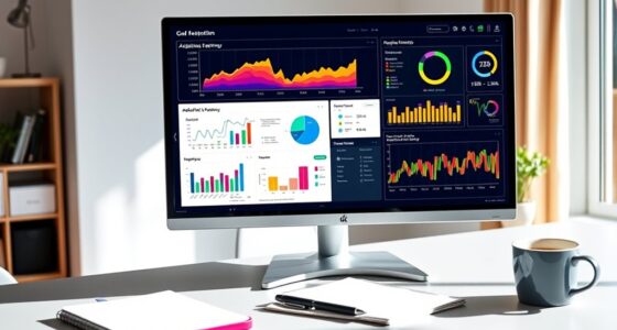
Using visual aids when teaching statistics can markedly enhance students’ understanding by making abstract concepts more concrete. When you incorporate data visualization into your lessons, you’re providing students with a powerful tool to grasp complex statistical concepts. Visual representations like charts, graphs, and diagrams simplify data interpretation, allowing students to see patterns, trends, and relationships at a glance. Instead of struggling with raw numbers, they can focus on the story the data tells, which deepens comprehension and retention.
Data visualization is especially effective because it transforms numerical data into visual formats that are easier to interpret. For example, a histogram can quickly show the distribution of data, revealing skewness or modality that might be difficult to detect in tables. Similarly, scatter plots help students understand correlations between variables, making it clear whether relationships are positive, negative, or nonexistent. By actively engaging with these visual tools, students move from passive observers to active participants in exploring statistical concepts.
Visual tools like histograms and scatter plots transform data into understandable, engaging insights.
When teaching statistical concepts such as measures of central tendency, variability, or probability, visual aids serve as bridges between theory and real-world application. For instance, box plots illustrate median, quartiles, and outliers, making the concept of spread more tangible. This visual approach helps students see how different data points influence overall measures, fostering a deeper understanding of variability. Likewise, probability trees or Venn diagrams clarify complex probability problems by visually breaking down possibilities, reducing confusion and increasing confidence.
Integrating data visualization into your instruction also encourages students to think critically about the data they see. It prompts questions about why certain patterns emerge or what the visual tells us about the underlying data. This critical thinking is essential for mastering statistical concepts and for applying them effectively in real-world situations. Moreover, visual aids can make lessons more engaging and interactive, motivating students who might find traditional lectures dull or overwhelming.
Additionally, understanding the science behind visual tools can improve the accuracy and effectiveness of your teaching methods, as sound principles guide the selection and design of visual aids. To maximize these benefits, verify your visual aids are clear, accurate, and appropriately scaled. Use color strategically to highlight key points, and provide guidance on how to interpret each visual. Combining visual tools with hands-on activities—like creating their own graphs or analyzing real datasets—can reinforce learning and boost confidence. Ultimately, by leveraging data visualization and other visual aids effectively, you help students develop a stronger, more intuitive understanding of statistics, empowering them to analyze data confidently and thoughtfully.
Amazon Product B0D9MK23S7
As an affiliate, we earn on qualifying purchases.
Frequently Asked Questions
What Are Common Mistakes to Avoid When Using Visual Aids?
When using visual aids, you should avoid overcrowded slides and misleading graphs. Overcrowded slides can confuse your audience, so keep them simple and focused. Misleading graphs can distort data, leading to misunderstandings. Always double-check your visuals for accuracy, clarity, and relevance. Use clear labels and consistent scales. Remember, your goal is to enhance understanding, not to overwhelm or mislead your audience with poorly designed visuals.
How Can I Tailor Visual Aids to Different Learning Styles?
Did you know that 65% of learners prefer visual content? To tailor visual aids, incorporate interactive elements that engage diverse learning styles. Use culturally responsive visuals to connect with students’ backgrounds. You’ll help them understand stats better by offering varied formats—charts, images, videos—so everyone stays engaged. Adapting your approach guarantees your teaching resonates, making complex data accessible and memorable for all learners.
What Software Tools Are Best for Creating Statistical Visualizations?
When creating statistical visualizations, you want software that supports interactive dashboards and enhances data storytelling. Tools like Tableau and Power BI excel at this, letting you build engaging, interactive visuals that clarify complex data. These platforms help you customize charts, add filters, and present insights effectively. Using them, you can craft compelling stories from your data, making your statistical presentations both informative and mesmerizing for your audience.
How Do I Assess the Effectiveness of My Visual Aids?
To assess the effectiveness of your visual aids, you should focus on measuring engagement and analyzing retention. Observe how your audience interacts with the visuals, noting if they stay attentive and participate. After your presentation, gather feedback or conduct quick quizzes to see what they remember. Tracking these indicators helps you determine if your visual aids improve understanding and retention, allowing you to refine your approach for better results.
Can Visual Aids Help Explain Advanced Statistical Concepts?
You might think visual aids can’t clarify advanced statistical ideas, but they can be surprisingly effective. With attention to graph clarity and thoughtful color choices, you make complex concepts more approachable. Visuals break down dense information, helping your audience grasp ideas like regression or probability distributions. When used well, visual aids turn intimidating topics into engaging learning experiences, making even advanced stats accessible and memorable for everyone.
Amazon Product B0BLT79X2G
As an affiliate, we earn on qualifying purchases.
Conclusion
Incorporating visual aids into your teaching can gently open students’ minds to complex statistical concepts. While it might seem challenging at first, these tools softly guide learners toward understanding, making the journey smoother and more engaging. Remember, even small visual touches can light the way to confidence and curiosity. With patience and practice, you’ll find yourself confidently helping students see the beauty in statistics—turning hesitation into a quiet, blossoming interest.
Amazon Product B0DQF8LRGZ
As an affiliate, we earn on qualifying purchases.
Amazon Product B0DNDXF5J9
As an affiliate, we earn on qualifying purchases.