
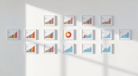
Choosing color-blind friendly palettes is essential for inclusive design. These palettes use combinations with sufficient contrast and avoid problematic color pairs that confuse users with common types of color blindness. Many resources provide pre-made, accessible color schemes designed for clear differentiation. By selecting these palettes, you make your content easier to understand and more welcoming for all. If you want to discover specific tips and tools, there’s more to explore on this important topic.
Key Takeaways
- Color-blind friendly palettes use distinct hues that remain distinguishable for various types of color vision deficiencies.
- Many resources and tools provide pre-made accessible palettes designed to meet contrast and visibility standards.
- These palettes often incorporate high contrast, avoiding problematic color combinations like red-green overlaps.
- Combining color with patterns, textures, or labels enhances clarity for users with color vision impairments.
- Testing palettes with color blindness simulators ensures they are effective across different types of visual impairments.

Choosing the right color palette is essential for making your designs accessible to everyone, including those with color vision deficiencies. When designing with accessibility in mind, one of the most critical factors is guaranteeing sufficient contrast ratios. Contrast ratios measure the difference in luminance between text and background colors, making content legible for users with various visual impairments. Low contrast can render your message unreadable, especially for users with deuteranopia or protanopia, common forms of color blindness. By carefully selecting colors that meet established contrast ratio standards—such as those recommended by WCAG—you notably improve readability and overall usability.
Ensuring sufficient contrast ratios improves readability and accessibility for users with visual impairments.
However, selecting colors isn’t enough on its own. You need to verify your choices through accessibility testing. This process involves using tools that simulate how your palette appears to users with different types of color vision deficiencies. Accessibility testing can reveal whether your color combinations are distinguishable enough for everyone, helping you avoid unintentional barriers. These tools often include contrast analyzers or color blindness simulators that allow you to preview your designs from the perspective of users with various impairments. Incorporating such testing early in your design process ensures you can make adjustments before finalizing your work, saving time and improving inclusivity.
When choosing a color palette, aim for high contrast between foreground and background colors, but don’t rely solely on color differences. Complementary cues, such as patterns, textures, or labels, can reinforce information and make your design more inclusive. For example, supplementing color-coded status indicators with icons or text labels helps users identify content correctly, regardless of their perception of color. This approach aligns with accessible design principles and enhances the overall user experience.
It’s also helpful to familiarize yourself with color-blind friendly palettes that are specifically crafted to be distinguishable by individuals with various types of color deficiencies. Many resources provide pre-made palettes that meet accessibility guidelines, making it easier to select colors that are both visually appealing and functional. Additionally, understanding the effectiveness of HEPA filtration and other technologies can inspire you to incorporate visual cues that complement your color choices for a more inclusive design. Remember, designing with accessibility in mind isn’t just a best practice; it’s a responsibility to ensure your content reaches the widest audience possible. Regularly testing and refining your color choices will lead to more inclusive, effective designs that everyone can enjoy.
color-blind friendly color palette tools
As an affiliate, we earn on qualifying purchases.
As an affiliate, we earn on qualifying purchases.
Frequently Asked Questions
How Do Color-Blind Friendly Palettes Impact Overall Design Aesthetics?
Color-blind friendly palettes enhance your design’s visual harmony by ensuring all users can distinguish elements easily. This consideration fosters an inclusive experience, positively shaping viewers’ emotional response. By choosing accessible colors, you create a more unified and appealing aesthetic that resonates universally. This thoughtful approach not only improves usability but also demonstrates your commitment to accessibility, making your overall design more engaging and effective for diverse audiences.
Can Color-Blind Friendly Palettes Be Customized for Specific Brands?
Did you know that over 80% of brands customize their palettes to improve accessibility? You can definitely tailor color-blind friendly palettes for your brand, enhancing palette flexibility and ensuring your visuals resonate with everyone. By incorporating brand-specific hues, you create a unique identity while maintaining accessibility standards. Customization not only boosts brand recognition but also demonstrates your commitment to inclusivity, making your design both functional and memorable.
What Tools Are Best for Testing Color-Blind Accessibility?
When you’re testing color-blind accessibility, the best tools help you evaluate how your palette performs for all users. Accessibility testing tools like Coblis, Stark, and Color Oracle allow you to simulate various forms of color blindness, ensuring your palette customization meets diverse needs. These tools make it easier to identify problematic color combinations, so you can refine your design for maximum accessibility and inclusivity.
Are There Industry Standards for Color-Blind Friendly Palette Creation?
Oh, surely there are strict industry standards for creating color-blind friendly palettes, right? Well, not exactly. While some accessibility benchmarks and industry guidelines exist, they’re often more of a helpful suggestion than a strict rulebook. You should follow best practices like high contrast and distinct hues, but keep in mind, standards vary. Ultimately, designing with empathy and testing remains your best bet for inclusive visuals.
How Do Color-Blind Friendly Palettes Affect User Experience Metrics?
You’ll find that color-blind friendly palettes positively influence user experience metrics by improving color differentiation for all users. When you choose accessible colors, you make it easier for users to distinguish content, which boosts user engagement. This enhanced clarity reduces frustration and encourages longer interactions. Ultimately, prioritizing color differentiation through thoughtful palettes creates a more inclusive, satisfying experience that benefits your overall user engagement metrics.
contrast ratio analyzer for web design
As an affiliate, we earn on qualifying purchases.
As an affiliate, we earn on qualifying purchases.
Conclusion
Now that you understand color-blind friendly palettes, you can craft visuals that are both inclusive and vibrant. Imagine a rainbow—bright, diverse, and harmonious—yet accessible to everyone. Just as a painter combines colors to create unity, you can choose palettes that bridge gaps, ensuring no one is left behind. Embrace these tools to make your designs more welcoming, turning your visuals into bridges rather than barriers, and truly connecting with every viewer.
accessible color scheme generator
As an affiliate, we earn on qualifying purchases.
As an affiliate, we earn on qualifying purchases.
color blindness simulator software
As an affiliate, we earn on qualifying purchases.
As an affiliate, we earn on qualifying purchases.